A little while ago I mentioned that I’d be discussing the various options for hanging prints of your own photographs at home and today’s post aims to give you some ideas of how to go about this. I should point out that, far from being an exhaustive discussion of every possible option, I’m actually only going to discuss one option in detail, although I do mention some others. The reason for pushing one particular option is that I feel it serves a dual purpose. For those who just want a low cost, low effort way of displaying their work – one that doesn’t have to last for years – this may be a simple way to achieve an elegant result. For those wanting to move a bit further into the art of framing, this same process acts as the very basis for that option.
Before I dive into this I’m making an assumption: You’ve already got a printed image, either from your own printer or from a high street or online company, and that it is an inkjet image. The fact that it has been printed on an inkjet printer will be important when considering certain display options although after talking to a few professional framers I’m becoming convinced that some of these “old-school” techniques for mounting a photograph to a rigid surface are becoming less relevant. In many ways this is good for the home framer as those techniques involve expensive and bulky equipment.
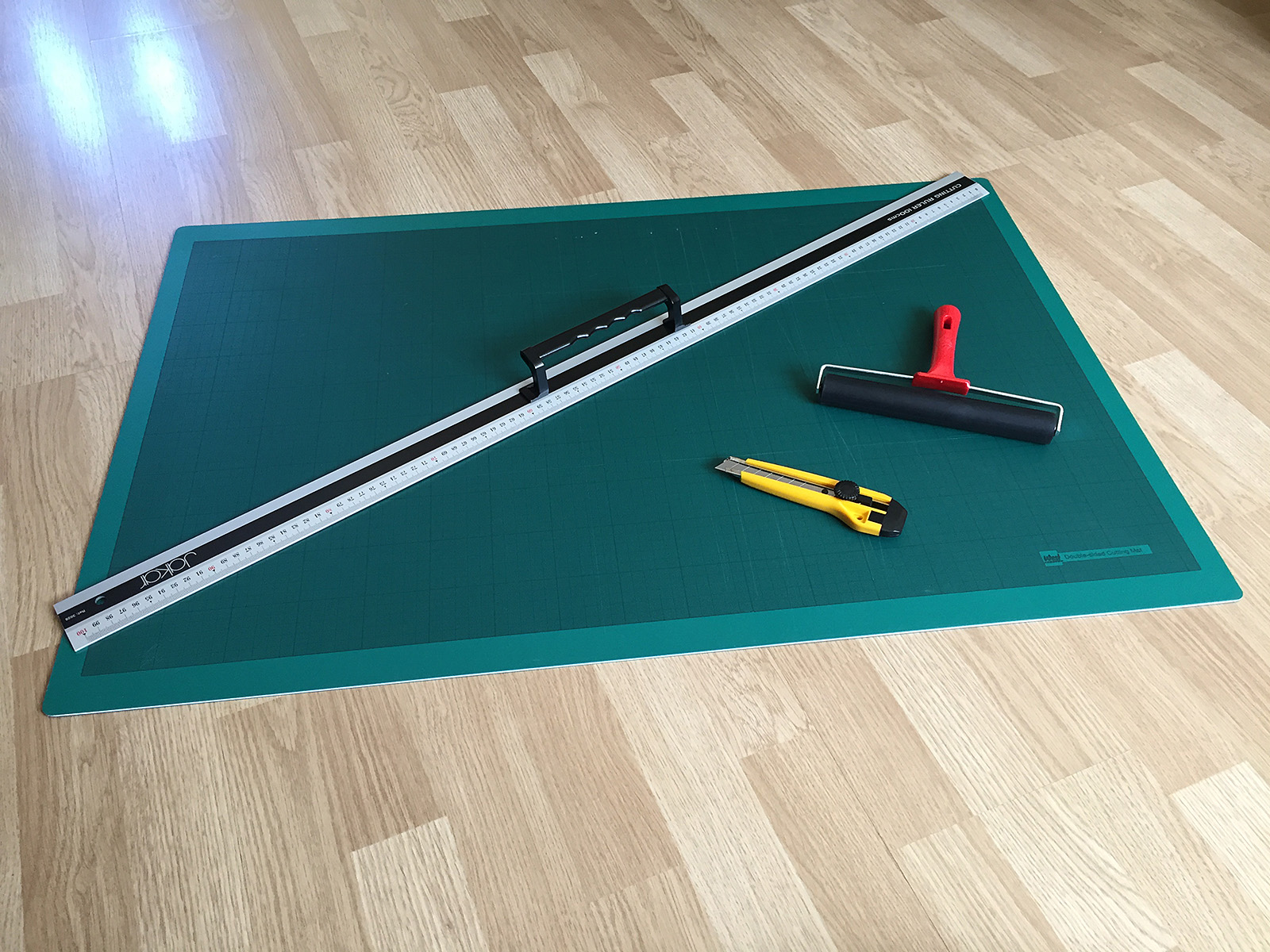
You don’t need many tools – you may even already have most of what’s needed.
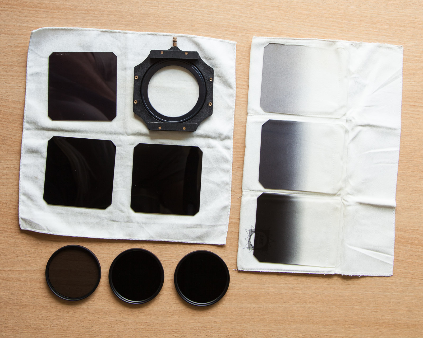
Speaking of equipment you are going to need some although thankfully it is not only cheap, but you may already have some it.
- A cutting board, needed to protect whatever surface you’re working on.
- A very sharp craft knife, such as an X-Acto.
- A clean straight edge for cutting, longer than the longest edge of your image.
- A roller of some kind to flatten the photograph against the mat board or foam board.
As with everything there is some terminology to try and remember, simply because you’ll have to buy some supplies and asking a shop assistant for the right thing usually helps.
- Backing board – the rear board (usually 2mm hardboard) that sandwiches all the parts of a framed image in place. Not needed unless you’re framing the image.
- Mount board – the flat and rigid board that the image rests on, typically mat board or foam board. All images will need to be mounted in some way.
- Mat board – A piece or card or cotton fibre board usually 1.4mm thick. There are several grades available depending on how expensive/important the artwork is.
- Mat – Mat board with a window cut out that surrounds the image and provides visual separation from the surrounding wall and keeps the front glass from touching the image.
- Foam board – a lightweight board with a dense foam core coated in paper. Usually comes in white or black. Also called foamcore.
- Moulding – the material that makes up the frame itself – usually wood or metal.
The “Off-The-Shelf” Compromise
Before I talk about materials there is one option to discuss: The pre-made frame. The theory behind pre-made frames is pretty straightforward – give you a professional finish but at a fraction of the cost of a bespoke frame. There’s a big pre-made market too and searching an online retailer such as Amazon shows an almost overwhelming choice, but I do have a couple of issues with pre-made frames because, if you’re going to the trouble of actually putting a frame around your image, you may as well do it properly.
For me a frame should achieve three basic aims: Support, protect and compliment. Support is a fairly easy job and really entails keeping the artwork flat and rigid – if you’re hanging the image on a living room wall you’re going to want to avoid curling corners or the image sagging under its own weight. Protection covers three elements: protection from the environment such as dust, tiny airborne droplets of everyday household liquids such as cooking oil and furniture cleaner and protection from the frame itself. And finally, the frame should complement the artwork, not detract or otherwise stand out.
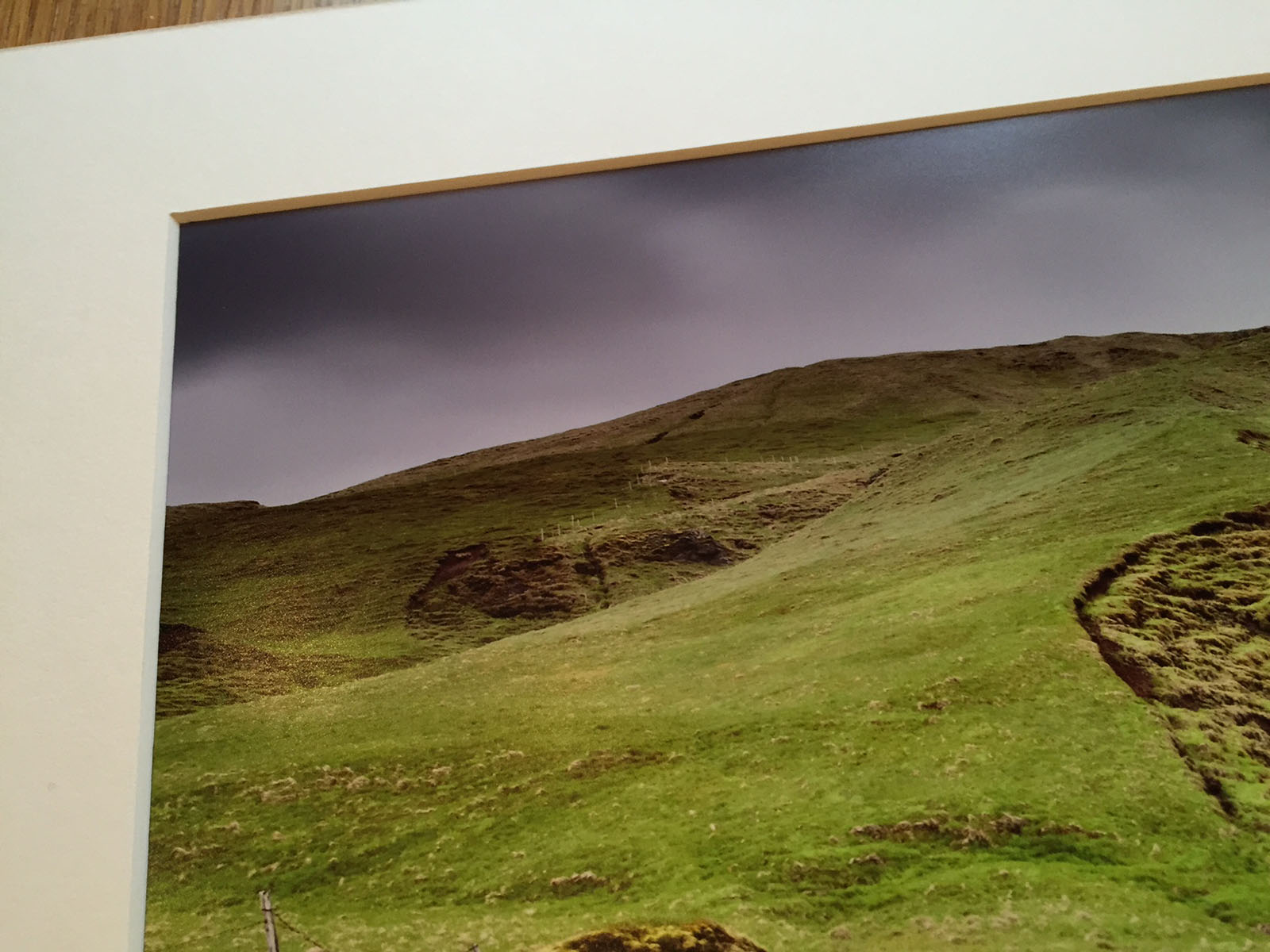
The problem I have with pre-made frames is they often fail to achieve at least one of these three goals. Most of them allow the glass (or these days more likely acrylic) to come into direct contact with the artwork which for inkjet images is a pretty bad idea. Not only can it cause the photograph to smudge but try changing the image in the future and you’ll find that part of it has stuck to the glass/acrylic due to trapped moisture in the inkjet print and the air itself. The way to avoid this is to use a separator between the glass and the image, usually a white card frame with a hole in the middle called a mat, but that then means either finding a pre-made frame with a mat that just happens to be cut to the right size for your image (otherwise we’ll fail the ‘compliment’ requirement), or getting a local or online framing company to cut a mat for you adding more expense to what was meant to be a low-cost option and simple option!
So, unless you’re very lucky – or simply don’t care – the pre-made option isn’t really an option.
Basics
The most basic element of framing is that of support – keeping the image flat and rigid. Luckily there are a number of ways to do this and you can achieve excellent results with very little cost as it simply entails sticking your image to a board of some kind – a process usually called mounting. There are two common choices for the mount board.
Mat board is a paper or cotton sheet, usually about 1.4mm thick. If you’re considering framing then you’ll have to buy mat board anyway because, as the name suggests, it is used to create the mat that separates the image from the glass. There are several types of mat board available such as museum, archival, conservation and standard and I’ll look at these in a future article but in essence if you’re looking to keep the image in top condition for a few years, a low acidity mat board is required. There is a huge range of different colours for mat board – remember that framing is not meant to detract from the artwork and so the mat has to compliment the colours of the image.
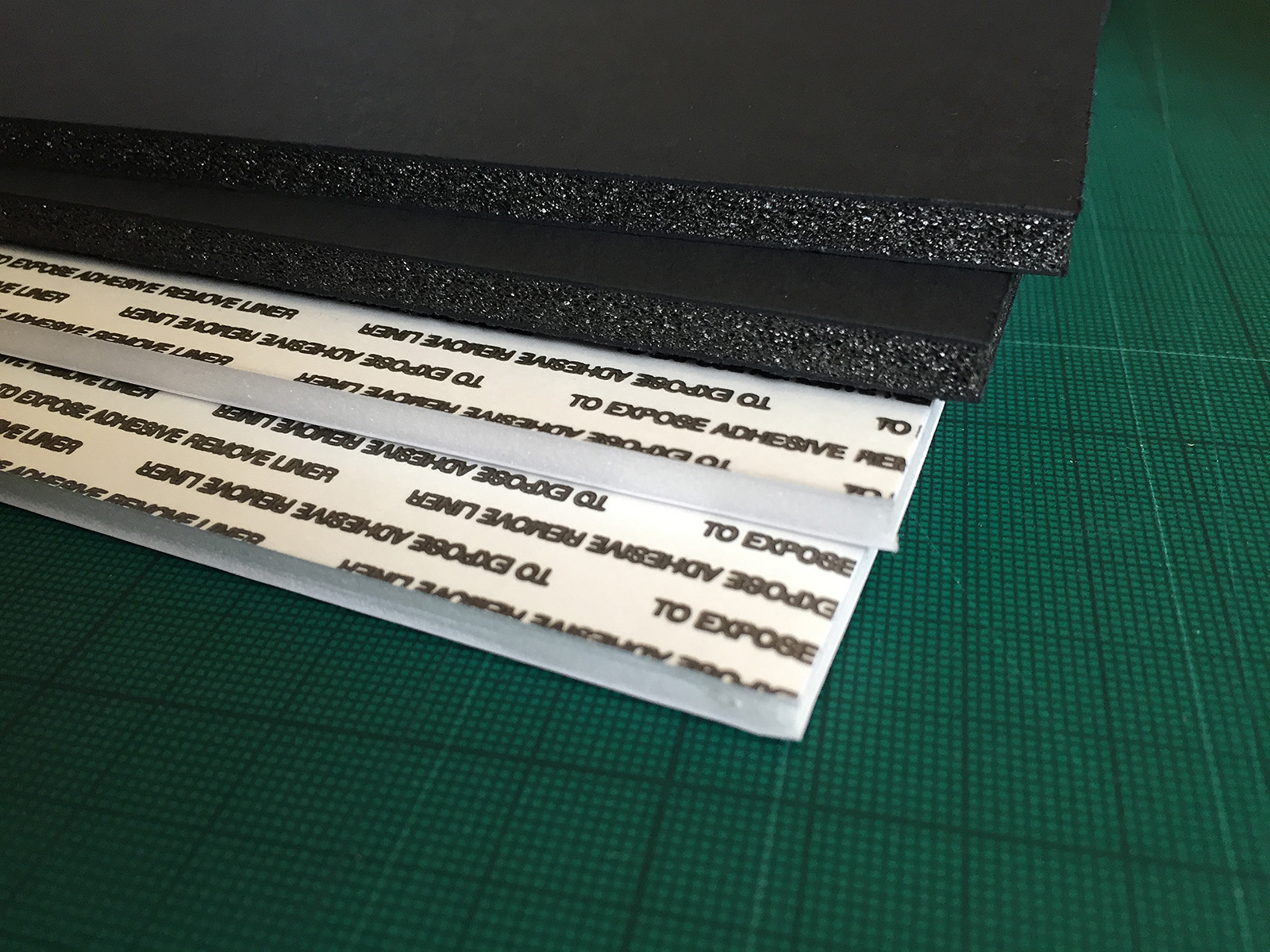
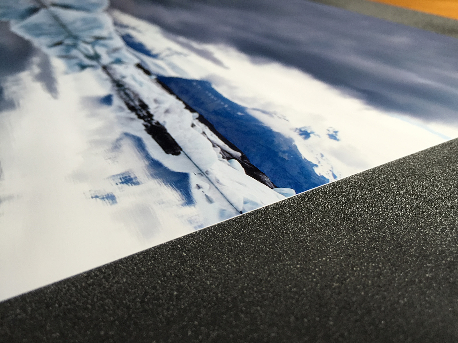
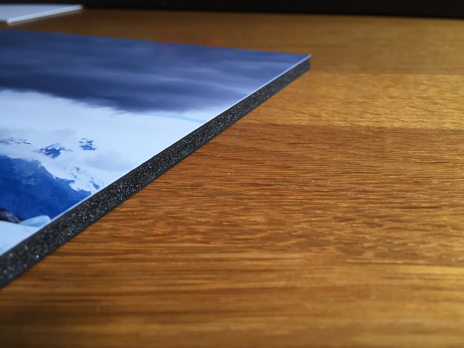
If you hate having too many options then choosing foam board is wonderful: Black or white.
Foam board and Foamex for our purposes achieve the same goal and differ only in whether you can print directly onto their surface and whether they are for indoor or outdoor use. Usual thicknesses are 3mm, 5mm and 10mm. Again, for long-term display, low acidity board is better. As foam board is not designed to be seen colour options as much more limited and usually come down to black or white.
To Frame or Not To Frame?
If the ultimate goal is to display your work in a frame then there isn’t an awful of difference between the two mounting options – mat board and foam board will achieve the same goal unless you’re getting very creative with mounting and looking at something like float mounting. I’m going to be looking at framing – and float mounting – in a future article but for today we’re trying to keep things as simple as possible.
The alternative is to simply not frame at all. The most common form of unframed art display is the canvas and these days you’d be hard pushed to find a hotel or trendy bar that doesn’t have art canvases on the wall. It’s a popular choice for the home environment too being hard-wearing and cheap compared to the professionally framed option. But, home-made canvasses are definitely not easy to get right.
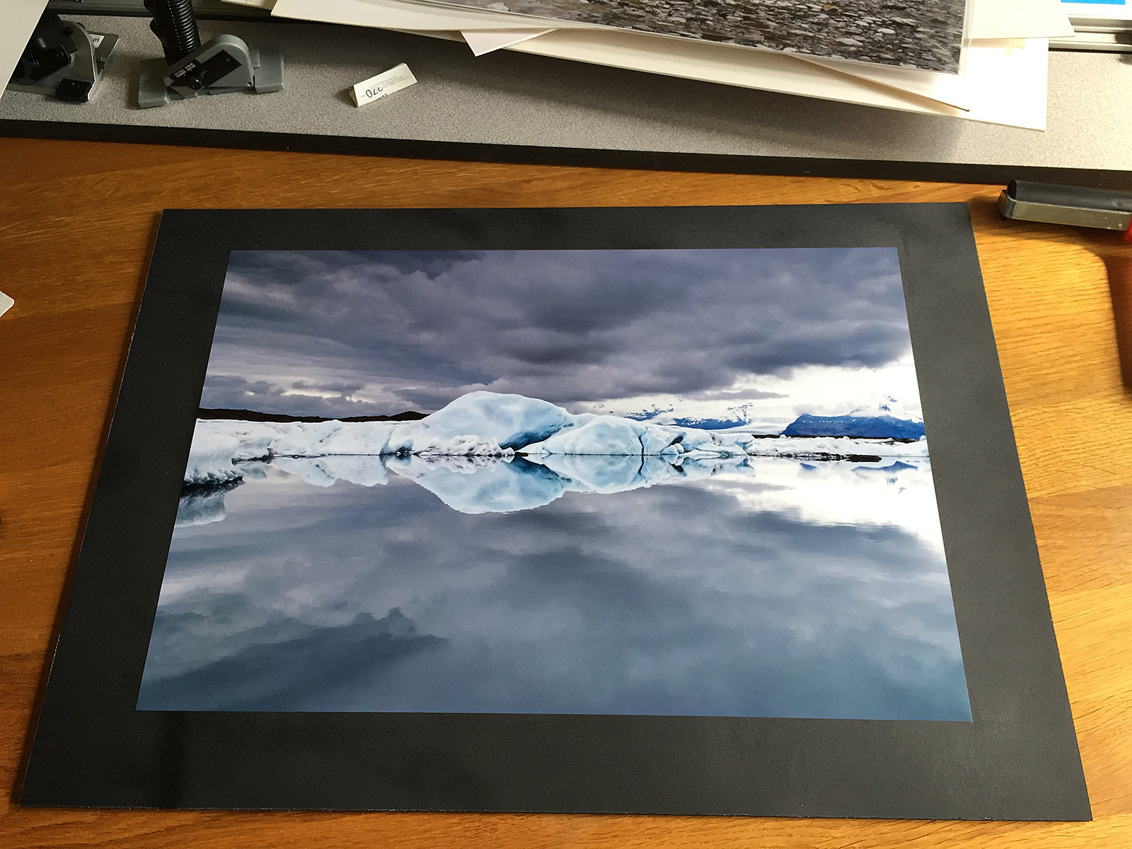
Another option would be to display the image simply mounted on foam board, making use of the thickness of the foam board to provide a visual separation from the surrounding wall. It won’t work for everyone as one of the uses of a mat is to separate the image from the distracting ‘noise’ of the wall and so if the wall is patterned (for example wallpaper) then this approach won’t give very good results. But as naked as the final product is, it has a contemporary feel and some exhibitions use this approach.
The other advantage is that it is simple and inexpensive, great if the artwork is to be changed frequently or likely to get damaged (children’s bedrooms, for example).
Buying foam board isn’t a difficult process. It is common enough that most hobby and craft stores carry it as a stock item and as mentioned earlier, colour choice is limited to white or black. I bought foam board off Amazon simply because I was buying in bulk and the cost savings were significant – half the price of buying in the local craft store – but even in store an A2 size foam board was approximately £4.50. The other thing you’ll need is some means of attaching the image to the foam board. The most common way to do this is using spray adhesive – again a common item in craft stores, although you can also get self-adhesive sheets of foam board.

About all you need to get your image ready for display is the foam board and some glue – both easily found in a craft supply store.
The Process
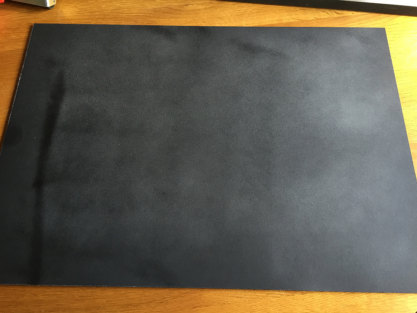
Now I’m going to assume that the next step really needs no detailed instructions – you have a photograph, a board and some glue and you really would have to try exceptionally hard to get it wrong, but there are a couple of tips worth mentioning. First, unless you have stunning hard/eye co-ordination, cut the foam board to be larger than the photograph and that way you won’t have to worry about perfectly aligning the image. Once the glue has dried we’ll trim it with the X-Acto knife. The other tip is to lay the image starting at one end and slowly lowering it much as you would when applying a screen protector to a phone. This way you’ll reduce the risk of air bubbles.
Here are some pictures of the process:
Spray adhesive usually requires a couple of minutes to become tacky.
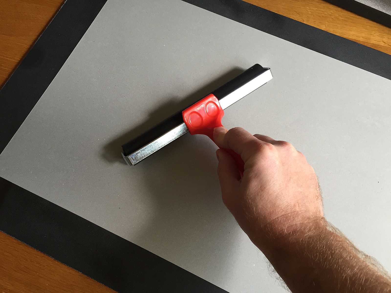
Cover the image with a protective sheet and the use a roller to press the image to the glued surface.
Check the photograph is firmly attached to the board. I covered the whole board in adhesive just to make sure.
As exciting as the whole process is, leave the adhesive to dry before attempting to trim the foam board to size.
Trimmed to size.
I’d suggest leaving the glue for a few hours to dry before trimming the image.
When trimming make sure that the blade is VERY sharp; cutting foam board with anything less will likely cause it to ‘bobble’ and as the foam board is now acting as the separator between wall and artwork it really has to look right.
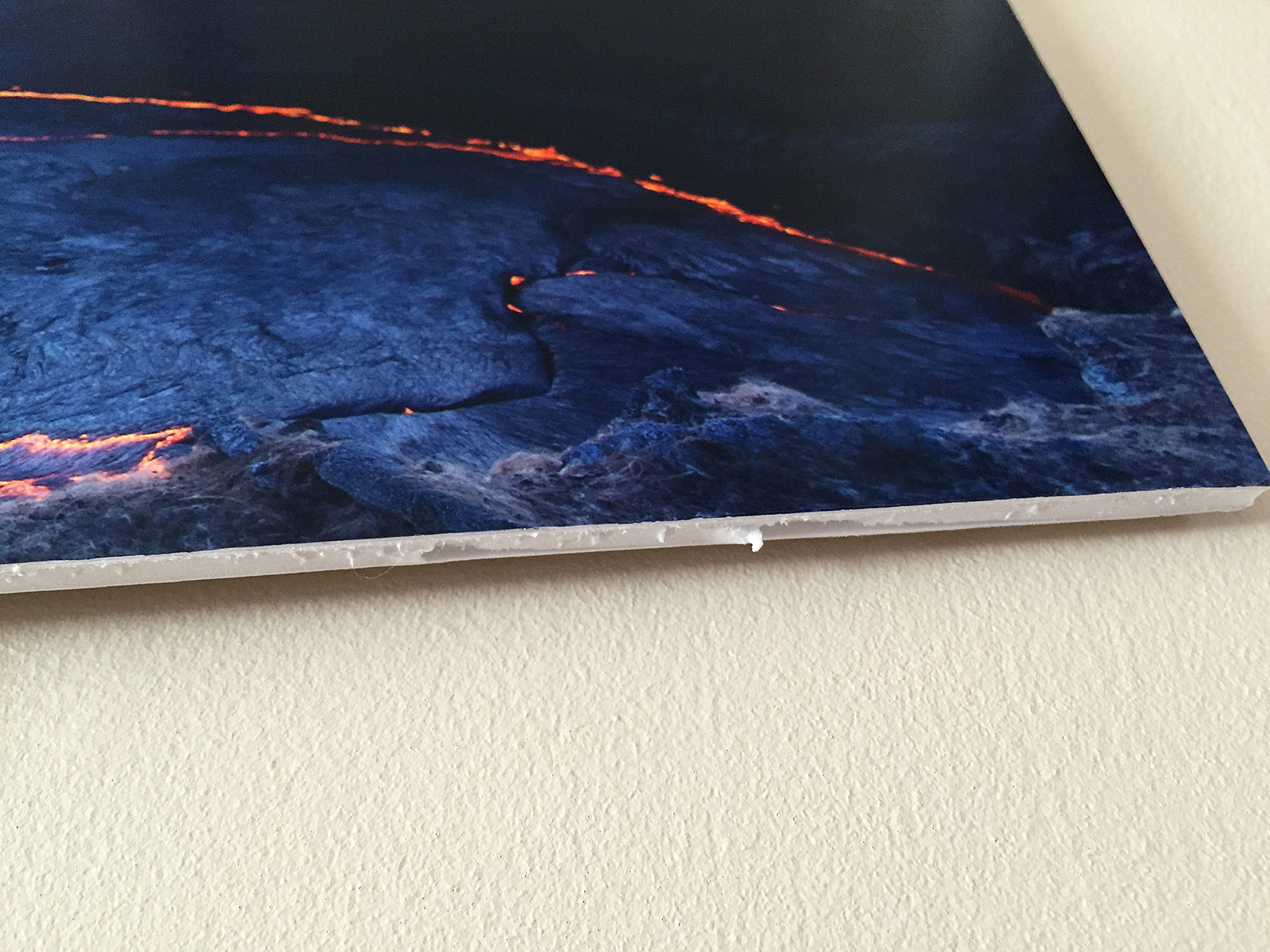
It won’t matter how good the image is – all you will see is the shabby cutting.
Display Options
One of the things to bear in mind with mounting in this way is that the result is quite fragile; the foam board is delicate and banging the edge will likely result in it being dented. It can be passed around to people or left on a coffee table, but its best use would be for display on a table top easel or placing on a wall. One of the benefits however is that the final product is really lightweight and so you can make use of a simple wall mounting option such as the 3M Command picture hanging strips – inexpensive velcro pads – so no need to make holes in the wall.
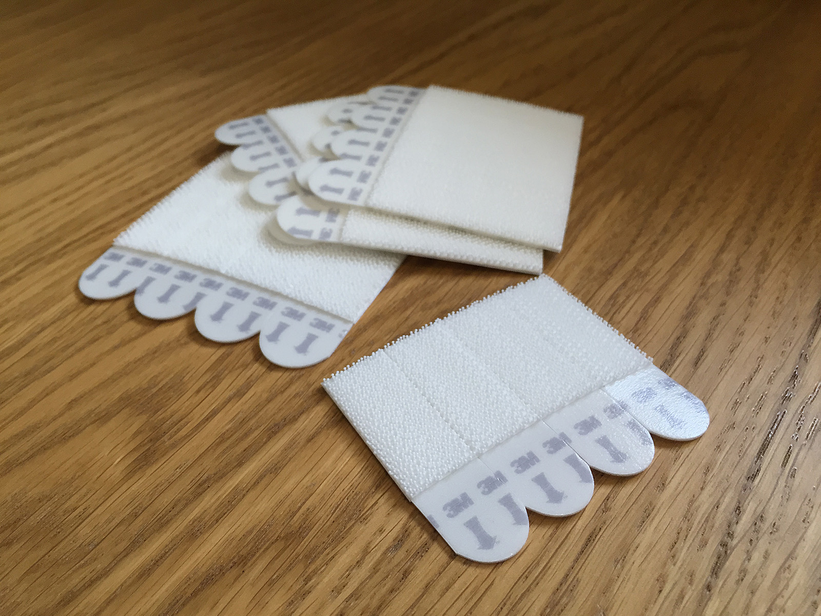
For lightweight work the 3M Commander strips should do a perfect job.
So, how does it look?
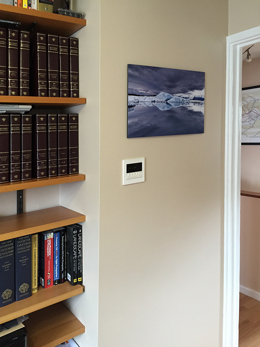
For an inexpensive contemporary feel I’m very happy with the result, especially as it is very easy to change the image whenever I want.
Like songs, everyone has a favourite photograph – one that has the power to lift the spirits when we are feeling down. So why not get these images out in the open and on your walls? Hopefully today’s article will convince you that doing so needn’t be an expensive, difficult or messy process.


![Same image, but a different feel. [Click to enlarge!]](http://davehoggan.com/wp-content/uploads/2015/04/jokulsarlon_wallpaper.jpg)

![There's no denying that a large image or graphic make a striking statement, but you have to choose carefully. The image should be timeless and detailed enough to reward people for repeated viewing with details they've missed in the past. [Click to enlarge]](http://davehoggan.com/wp-content/uploads/2015/04/MG_2667.jpg)
![Meeting rooms can be clinical places often decorated as an afterthought, if at all. Add a feature image (and maybe a potted plant or two) and even small rooms can feel more welcoming. [Click to enlarge]](http://davehoggan.com/wp-content/uploads/2015/04/MG_2655.jpg)
![It is a great way to encourage employees to take pride in the appearance of their place of work - by making it personal. [Click to enlarge]](http://davehoggan.com/wp-content/uploads/2015/04/MG_2661.jpg)
![Even a 10.1MP camera like the Canon 40D can produce respectable sized images like this 150cm by 100cm canvas. [Click to enlarge]](http://davehoggan.com/wp-content/uploads/2015/04/MG_2626.jpg)