There is a scene in the 1999 film The Matrix in which the protagonist Neo awakens from a virtual reality training session and states, simply “I know Kung fu”. It is an important moment as it is the point where the character understands that he can control the World around him and is the catalyst for his growth.
Thanks to Emil von Maltitz, lead photographer on the recent Nature’s Light “Composing the Dunes” Namibian workshop, I too can say: I know Kung fu. At least of the photographic variety.
The review of that trip is being written so I’m not going to talk about it here in detail but my hopes for it were simple: That they show me show great photographic locations and that I could photograph them without people getting in the way. I had no expectations other than that.
It is worth mentioning that I primarily use Adobe Lightroom for cataloguing and image processing as I find it simple and it has all the features I need to post process images without having too many to be cluttered. I have used Photoshop in the past – and have it as part of the Adobe Creative Cloud package – but I’ve never really liked it due to its complexity and over-engineering for my needs. If truth be told, I knew the Photoshop could do some clever things but even with online videos and tutorials I always struggled to use it – so much so that I simply avoided it.
I’ve also never tried astrophotography before. Well, I made an attempt in Iceland earlier this year, but the results were decidedly underwhelming. I knew from the itinerary that the Nature’s Light workshop made a bit of a feature of astrophotography and was keen to try it, but didn’t have high hopes as it would be my first real attempt.
In short, the best I could have hoped for a month ago was this:
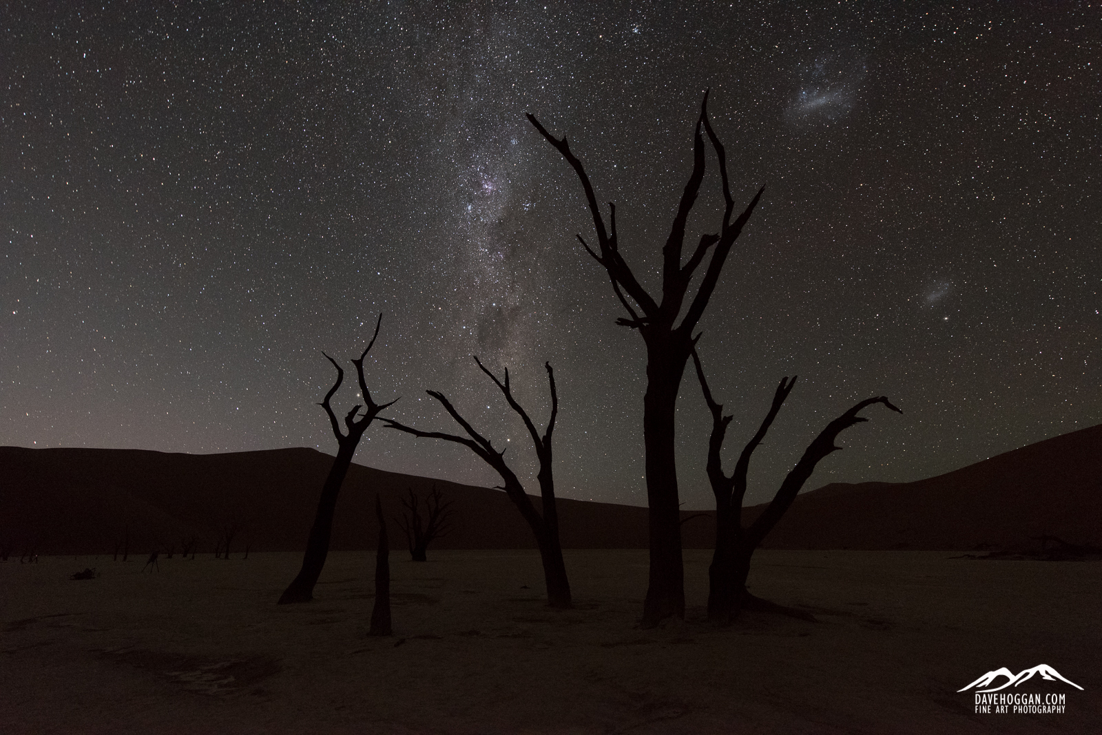
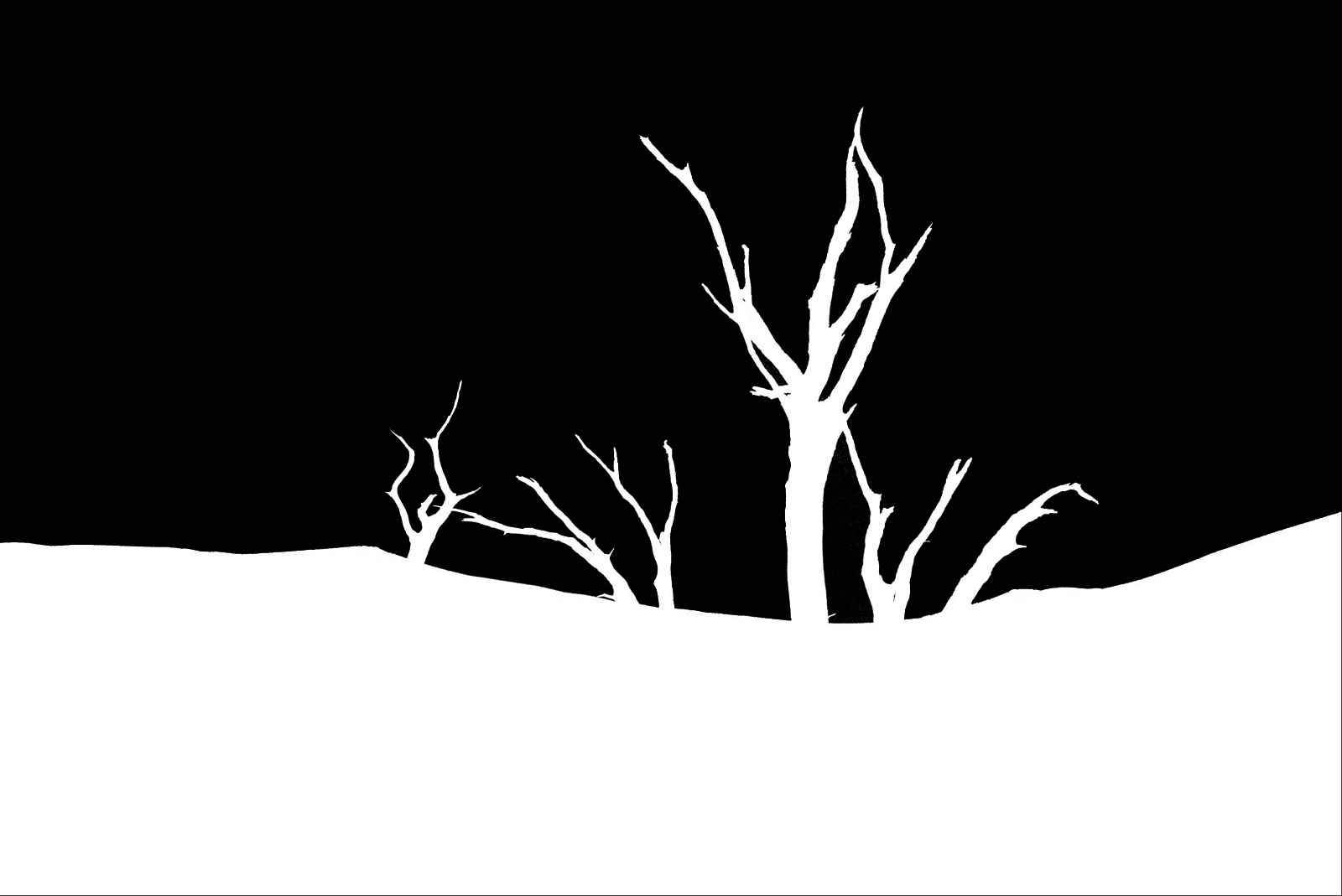
Despite the eye-catching sky in the past this image would have not made first pick as I lacked the skill to process it.
A quick glance and it all looks reasonable. As you can see the stars, well, look like stars, the Milky Way is distinct and the Large and Small Magellanic Clouds look suitably like galaxies. In fact, if this image were only to be looked at on a phone display or even a tablet then the image looks perfectly fine.
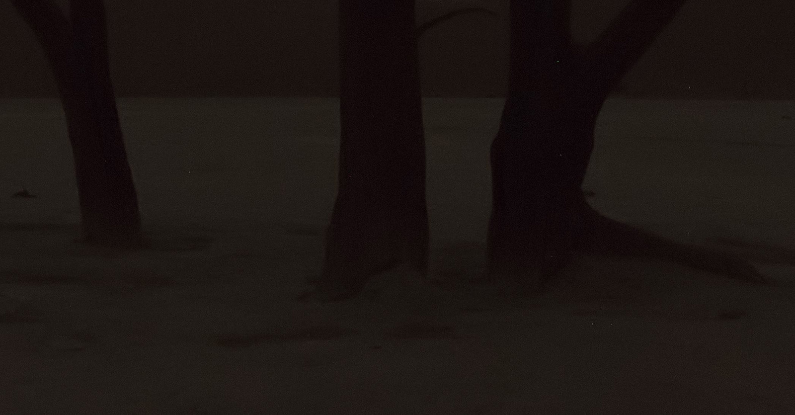
The problems become apparent when you zoom in and look at the foreground. In the 100% crop of the image below we can see the graininess of the tree trunks, the dried earth ground and the sand dunes behind.
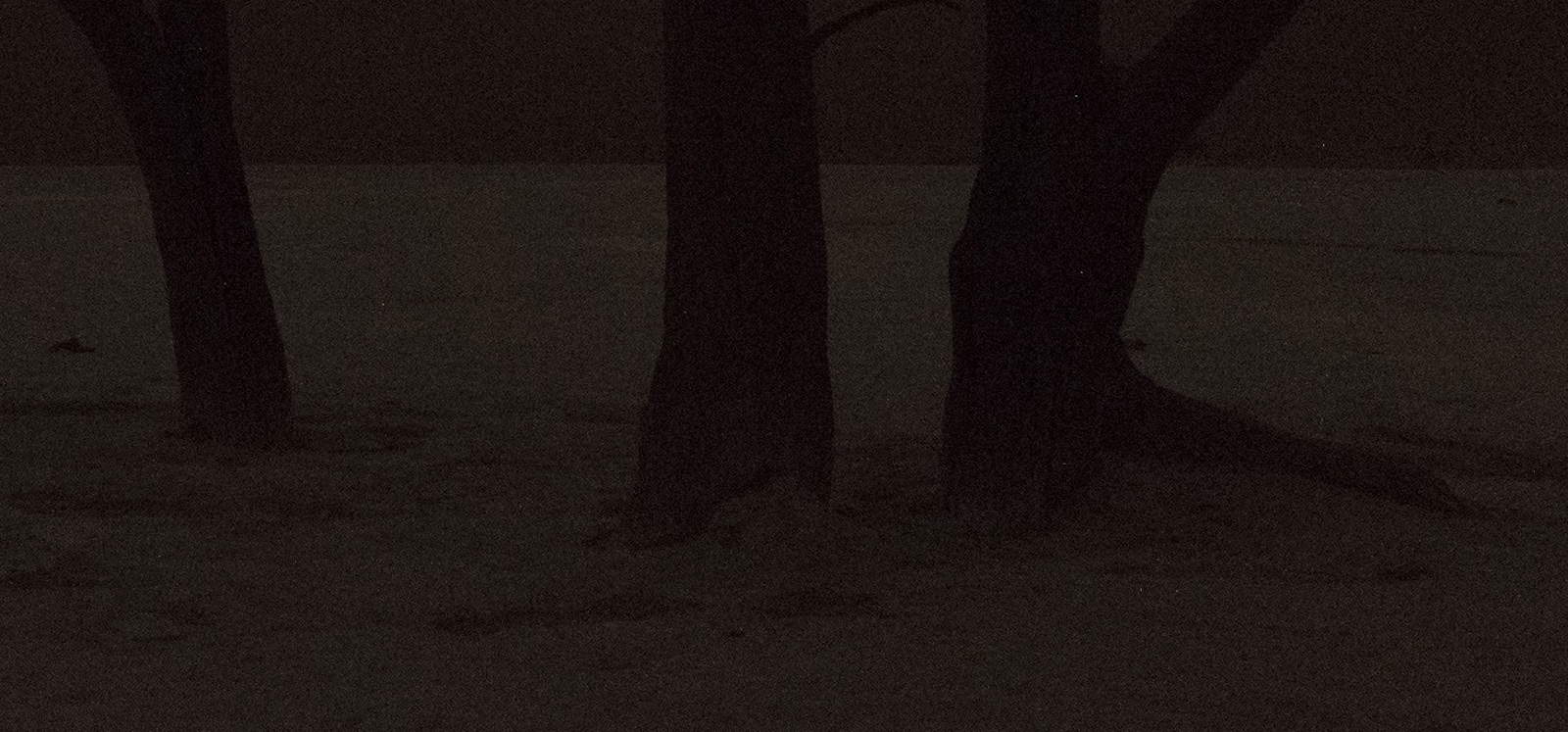
At ISO 6400 the noise present in the foreground is obvious. Dropping to a lower ISO, say 3200, would improve this but also require a longer exposure, blurring the stars.
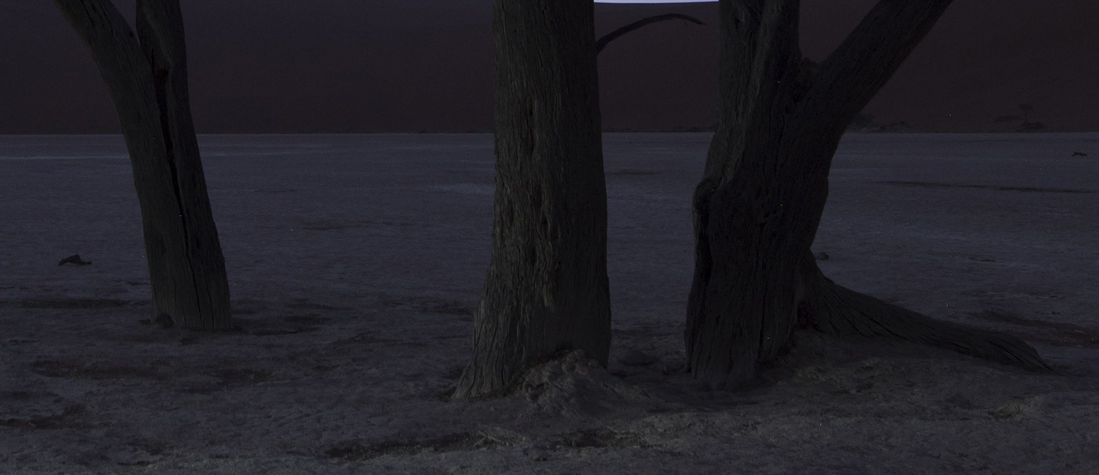
In the past my only option would have been to use Imagenomic’s Noiseware plugin so let’s see if that helps.
Noise can be removed via tools, but they remove detail too leaving an unnatural smoothness.
The noise has definitely gone but so too has all the detail. Unnatural and, again, unprintable. Of course I could drop the ISO speed to something more sensible, say ISO 400, and then compensate for the lower sensitivity to light by increasing the exposure time.
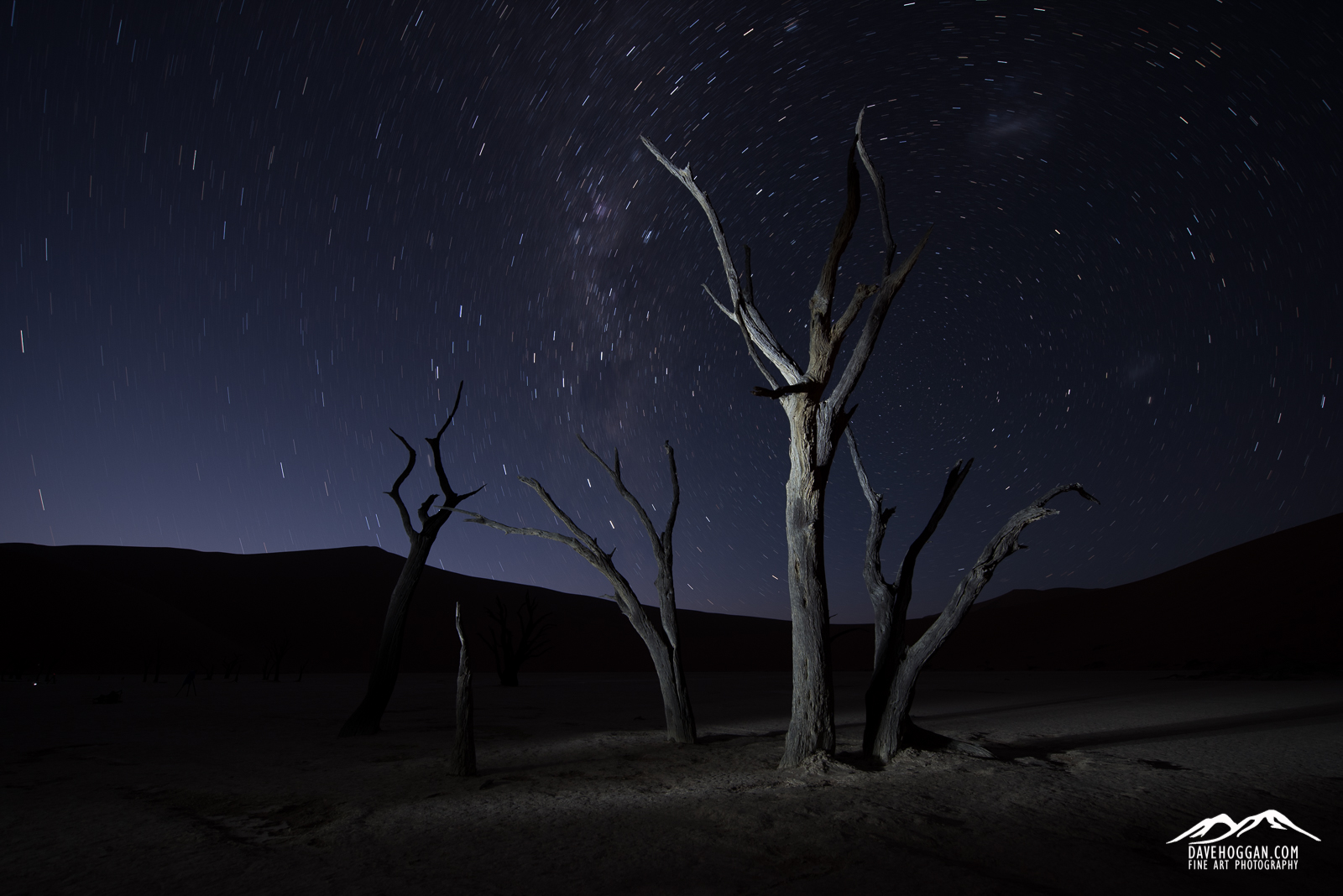
Showing the shutter to 240 seconds and lowering the ISO gives us low noise detail.
That’s much better! Very little noise and lots of detail. But with a four minute exposure the stars, well, they’re not stars anymore – they’re streaks!
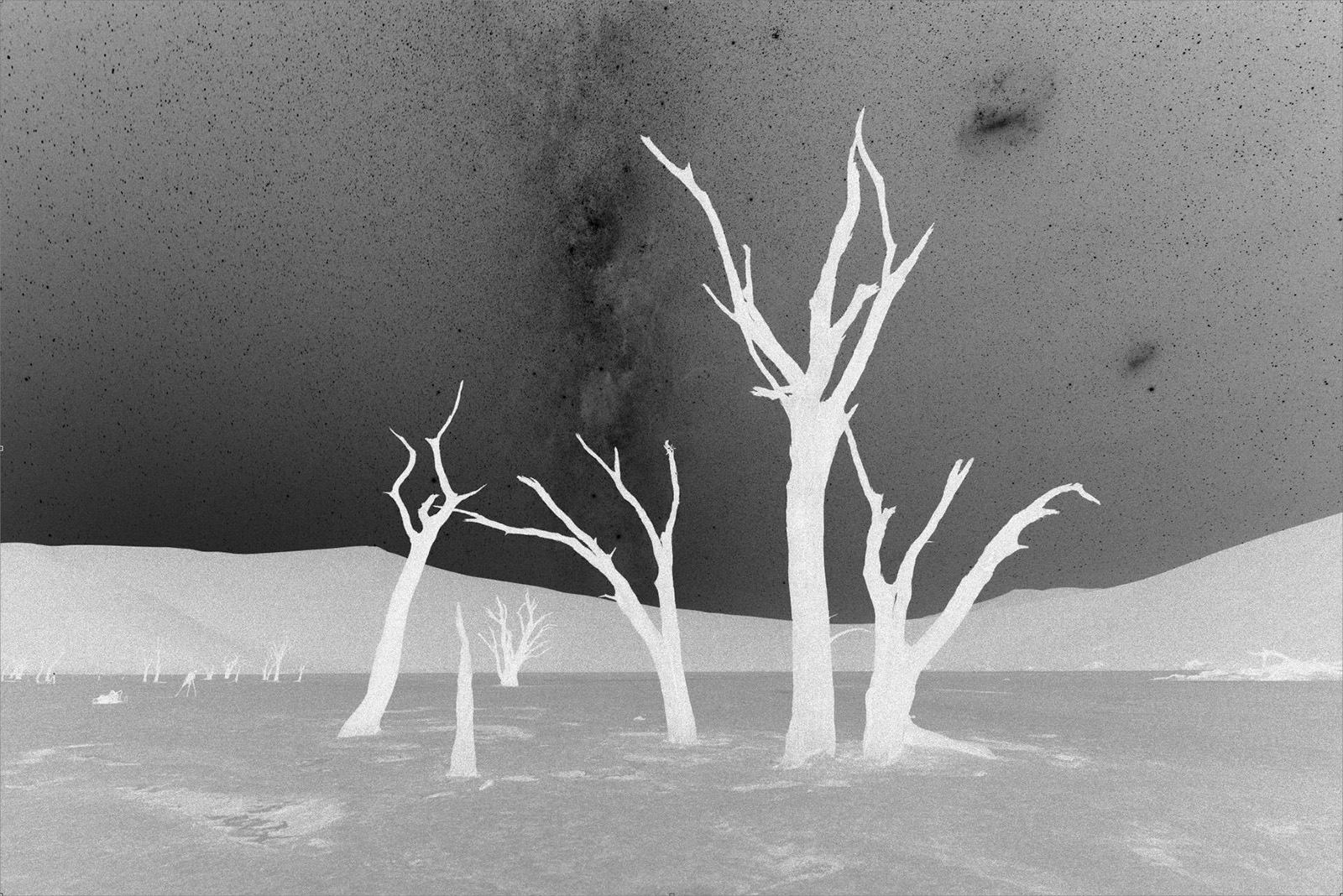
This image looks unusable but the foreground is low noise and detailed.
The answer is course simple: Take two images – one high ISO, short exposure for the stars and one low ISO, long exposure for the foreground – and merge them together using the masks feature of Photoshop. The issue is how do you create an accurate mask that separates the foreground from the sky when the trees are such an irregular shape. The lasso tool would be one option but it’d be a real pain to build a mask with additive lasso selections. You could manually create a mask using the brush tool and white and black ink, but that would take ages and never be truly accurate. And just to highlight a point I made above: I didn’t know Photoshop a month ago – I didn’t know that selections could be additive, I didn’t know how the different lasso tools worked. In other words I would have been stuck with an uninspiring image of a stunning location.
The Kung Fu
What Emil and the workshop gave me is two things. The first is an idea of how to photograph a scene for astrophotography – and the number of shots needed. The second is how to compile these individual images into the final shot.
Once you know the process it is easy to capture the individual images needed, of which there are actually four. The exact settings will vary depending upon location and the brightness of objects in the sky and foreground but as a starting point:
- An ISO 3200 (or ISO 6400), 20-30 second image at f/4 for the stars.
- An ISO 400, 240 second image at f/4 for the foreground with no light painting.
- An ISO 400, 240 second image at f/4 for the foreground with the trees painted by a torch.
- An ISO 400, 240 second image at f/4 with the lens cap on.
Of these four images, (1) and (3) appear in the final result and (2) and (4) are there to help build the final image. Image 1 is, as mentioned, taken to capture the stars as pin-pricks. Image 3 is the ‘foreground interest’ shot: low noise and good detail with some light painting to pull the eyes to aspects on the image and make it less flat. Image 2 is essentially the same as image 3 but not lit so that the foreground is dark to separate it from the sky. You could perhaps use image 2, but the light painting would bring the brightness of the foreground up to that of the stars which would hamper the next step. Image 4 – the one of the lens cap – is a dark frame. Any camera sensor running a long exposure will produce pixel glitches usually as coloured pixels. The dark frame captures just these glitches and can be used to remove them from the final result through subtractive masking.
The Kung fu that stitches these separate images together into the final result is Photoshop’s luminosity masks. Luminosity masks are difficult for me to explain simply as I don’t fully understand them, but in essence they allow you to create a mask not based on a shape (like the brush tool or lasso tool would) but on the brightness (or darkness) of the image. This is where image (2) is useful; the sky is bright due to the stars, but the foreground is dark. Here’s an example luminosity mask that is looking at the darkest parts of the image:
It is perhaps counter-intuitive but white shows the dark bits here simply because white shows the selection we are making and the selection in this case is the dark components of the image. Because image (2) purposely had no lighting on the foreground, it is in darkness and so it is added to the mask, but so too are parts of the sky because they are dark too. The mask is too detailed but it is easy to fix; once created a combination of a curves adjustment, the paint bucket tool and the brush tool allowed me to create a simpler – and more useful mask.
I wanted the sky from one image and the foreground from another and I now have a very accurate mask that makes a distinction between the two. It is a simple procedure to load the images (1) and (3) as layers in Photoshop and apply the mask to image (3). Voilà – pin-prick stars and low noise, detailed foreground.
Once you understand luminosity masks, everything becomes possible. Want to brighten just the stars? Create a ‘brights’ luminosity mask? Want to make the night sky cooler, more blue? Invert the foreground mask we created and apply it to a blue photo filter. The result?
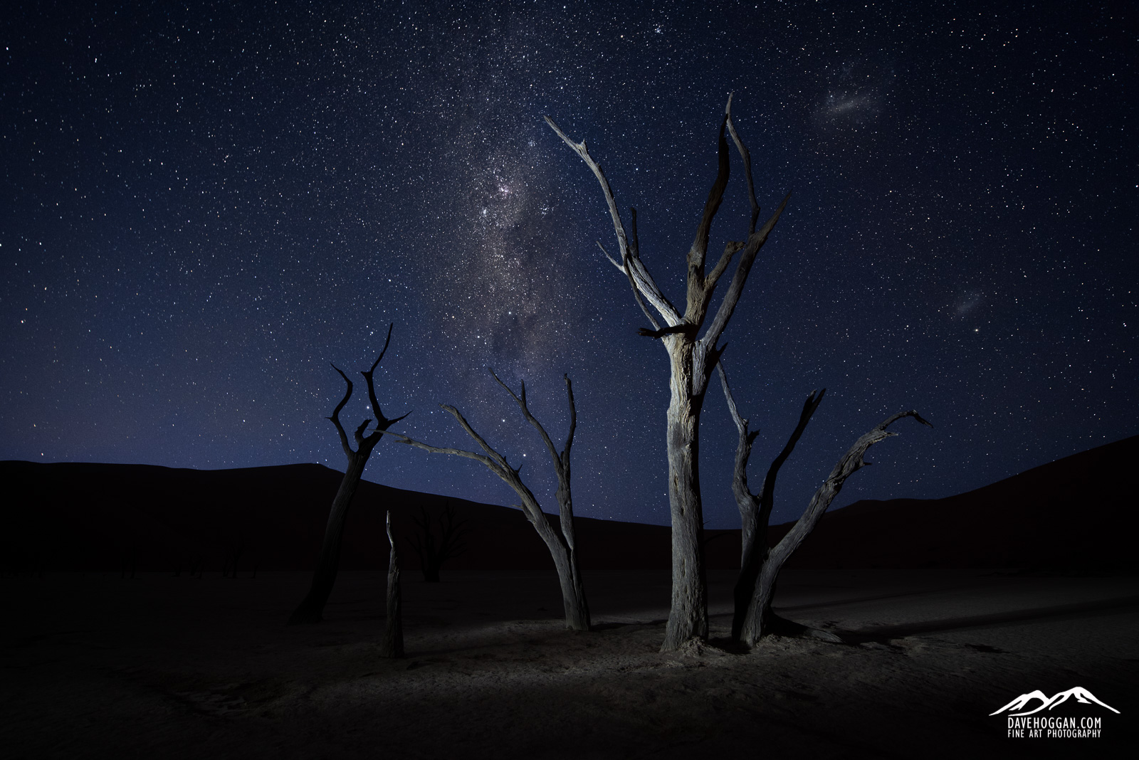
The final result. almost. Despite all the apparent Photoshop trickery, this is what my eyes were seeing on the night.
What impresses me most as I write this article is that, less than a month ago, I would have had no idea about any of the steps mentioned. I avoided Photoshop as I did not understand it, barely understanding the concept of layers and masks, but certainly not enough to use them properly. Could I have learnt this online? Maybe. I have tried in the past, but I don’t learn by listening; I learn by asking and doing. Now I know how to shoot the raw images and how to merge them into a single vision.
So, like Neo I now see that I can control the (photographic) World around me. It is a new skill and one with plenty of room to improve and develop. It’ll be a long road.
But isn’t that the fun part?


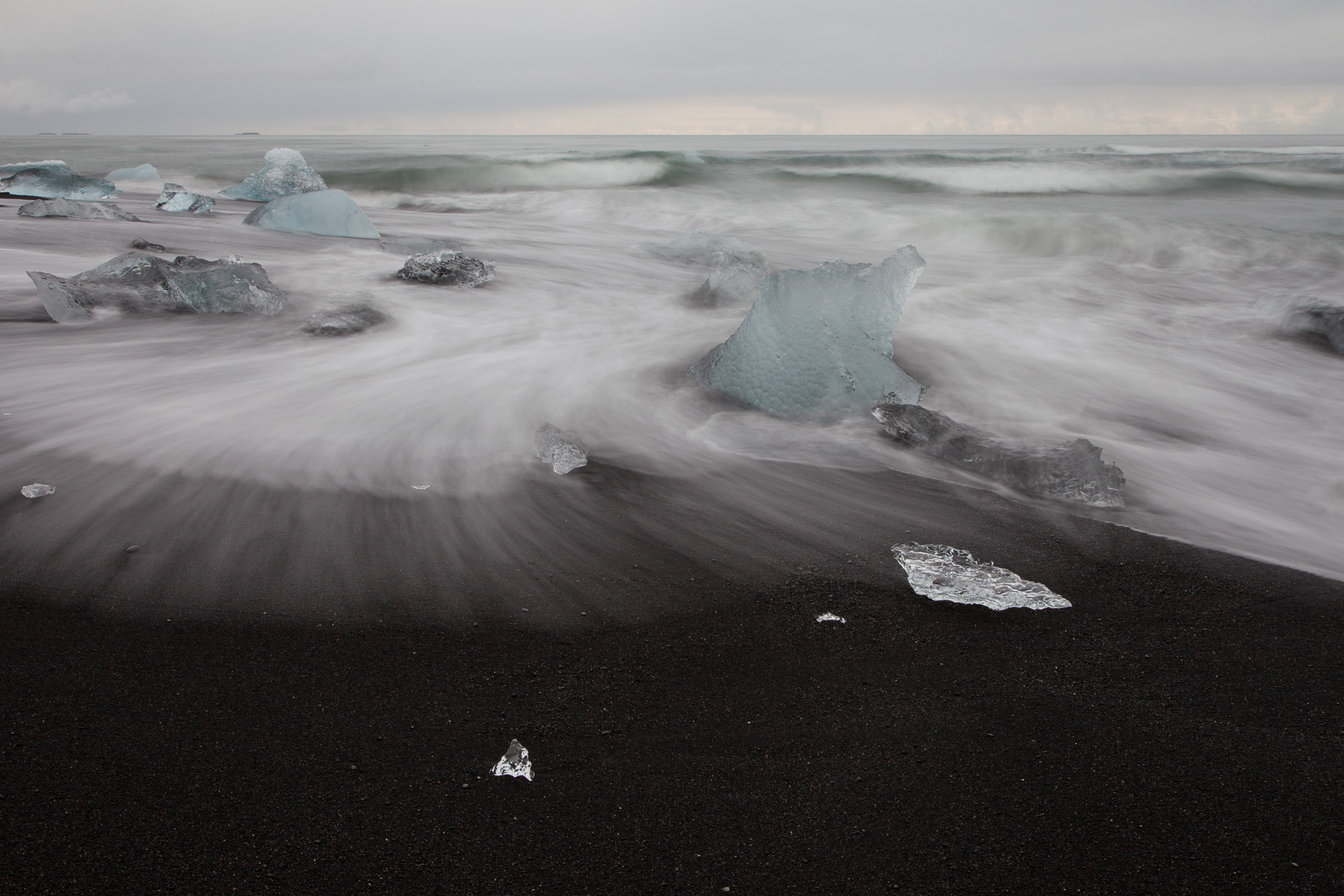
![Same image, but a different feel. [Click to enlarge!]](http://davehoggan.com/wp-content/uploads/2015/04/jokulsarlon_wallpaper.jpg)

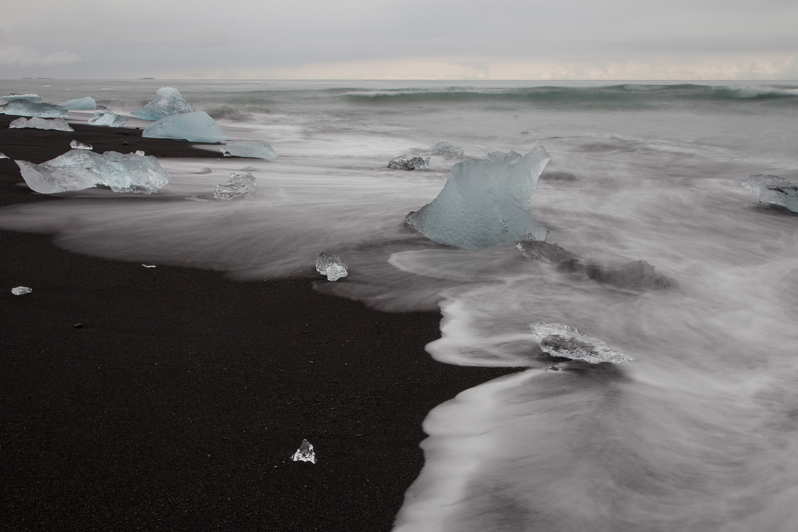
![There's no denying that a large image or graphic make a striking statement, but you have to choose carefully. The image should be timeless and detailed enough to reward people for repeated viewing with details they've missed in the past. [Click to enlarge]](http://davehoggan.com/wp-content/uploads/2015/04/MG_2667.jpg)
![Meeting rooms can be clinical places often decorated as an afterthought, if at all. Add a feature image (and maybe a potted plant or two) and even small rooms can feel more welcoming. [Click to enlarge]](http://davehoggan.com/wp-content/uploads/2015/04/MG_2655.jpg)
![It is a great way to encourage employees to take pride in the appearance of their place of work - by making it personal. [Click to enlarge]](http://davehoggan.com/wp-content/uploads/2015/04/MG_2661.jpg)
![Even a 10.1MP camera like the Canon 40D can produce respectable sized images like this 150cm by 100cm canvas. [Click to enlarge]](http://davehoggan.com/wp-content/uploads/2015/04/MG_2626.jpg)